Made with by Daniela in San Francisco Bay Area, Califronia.
Verdigris Style Guide
The best way to keep brand consistent is to develop a brand style guide
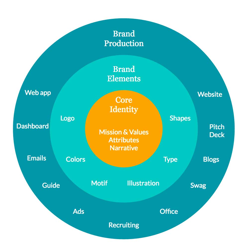
When I first came to Verdigris, I saw Verdigris as a really sweet guy, could help others very kindly, but his appearance was a little bit messy. So I developed a survey, to collect people's opinion, "If Verdigris were a person, what would they be like? Treat a company like a person, each person has goals, values, personality, and life story. When applied to an entire company, these are generally known as Mission, Values, Attributes, and Narrative."
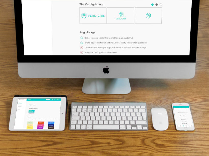
It helps employees, vendors and partners consistently use and communicate the brand. It outlines the basic rules for clearly and consistently creating and disseminating company communications – from allowable typefaces and styles to a color palette, to the logo and image use, to the tone and emotion portrayed by the brand. The goal is to make sure that no matter who contributes to your communications materials, your brand has a consistent look and feel.
- Brand Identity +
Company Personalities
I created a survey for the whole organization, "If Verdigris were a person, what would they be like?"
I collected the responses from colleagues. And summed-up the final tones of the company.
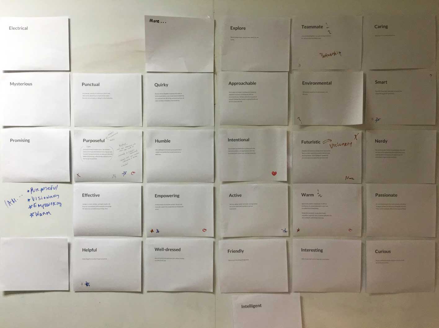
We decided to approve these characteristics from future design and marketing texts.
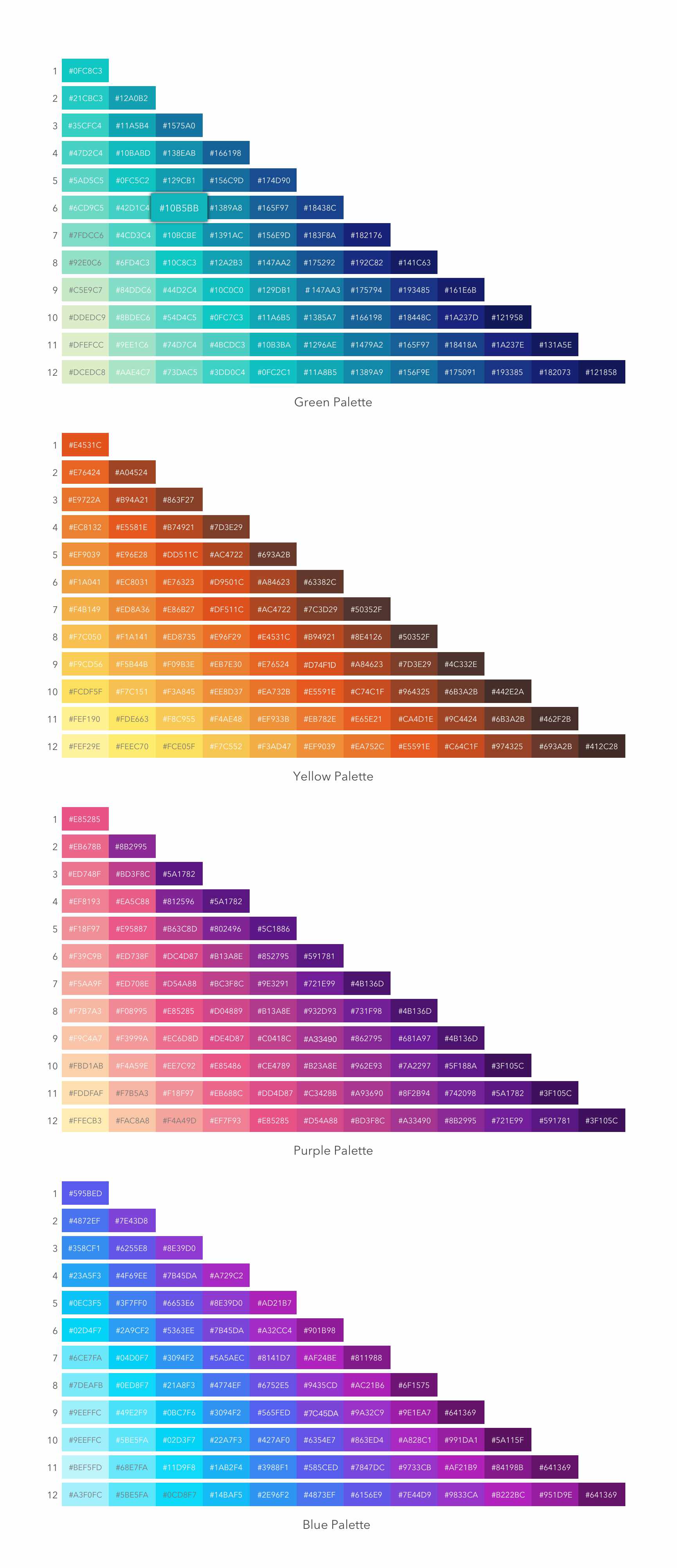
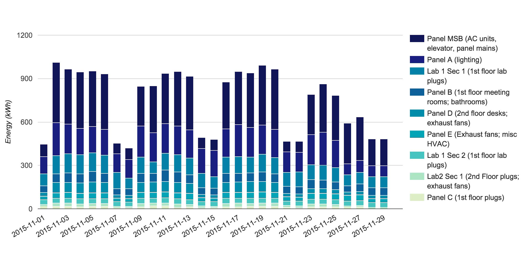
Color Scheme
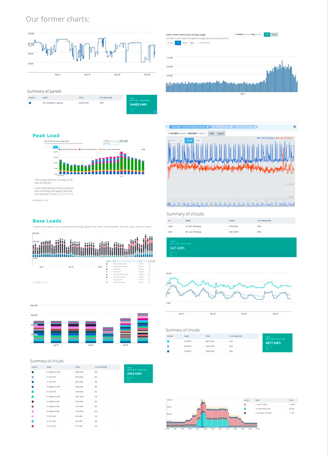
Our old color system was unfriendly to visual communication, especially in a busy chart design.
I got inspirations from a post Finding the Right Color Palettes for Data Visualizations by Samantha Zhang.
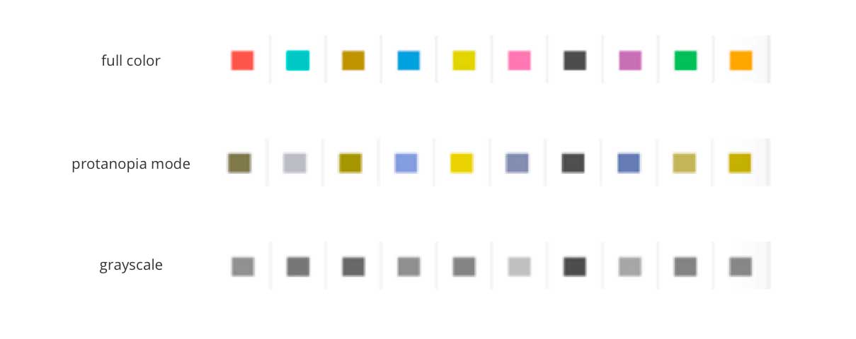
Rule 1: Have a wide range in both hue and brightness. To make sure color palettes are extremely accessible and easy to distinguish. Take any monochromatic color palette and test how it looks in Protanopia, Deuteranopia, and grayscale mode.
Rule 2: Follow natural patterns of color. Got inspirations from nature.
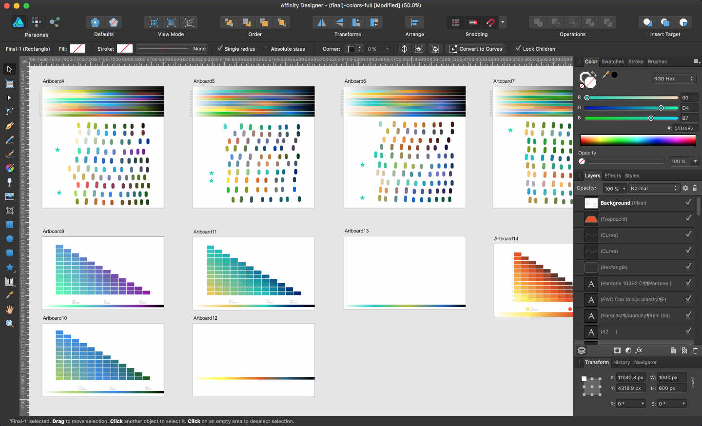
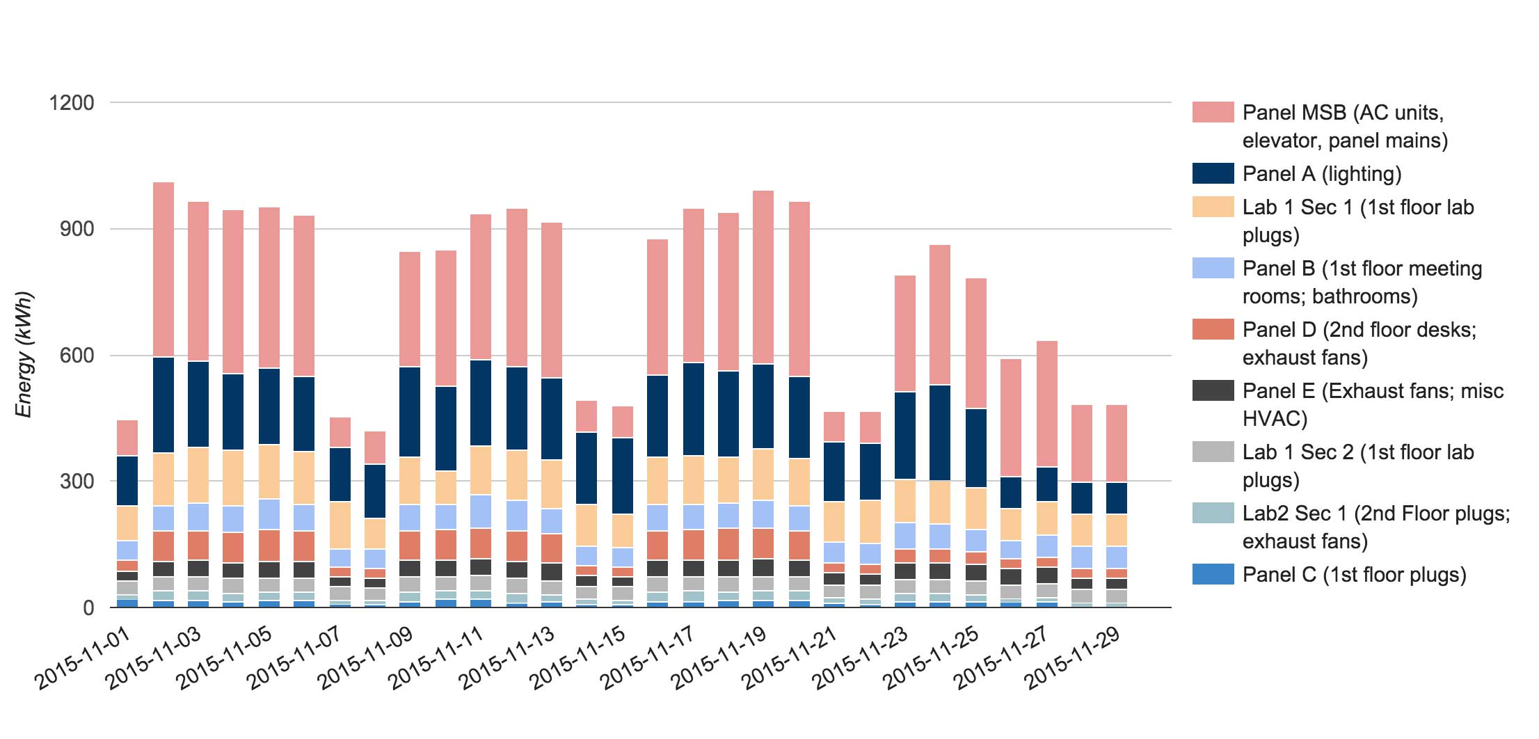
Here is a sample about how I imply the new color system into the chart design. The former vs. current.
8-point System
I implied the popular 8-point System into the style guide. Use multiples of 8 to define dimensions, padding, and margin of both block and inline elements. This system is benefical for designers, teams, and users.
For designers: Efficiency, less decision to make while maintaining a quality rhythm between elements.
For teams: An easy system of communication between designers and developers. A developer can easily eyeball an 8pt increment instead of having to measure each time.
For users: Consistent aesthetic to the brand they trust.
Final Design